We love branding projects. And we kind of grew to love horses after this project – that’s the effect of doing a branding project – after an in-depth understanding of the client’s business, we immerse ourselves in all related stuff to come up with the best creative solutions.
Premier Racing Partnerships (PRP) is poised to present a new interactive experience to Singapore that makes owning a racehorse easy, fun and exciting. The business involves acquisition, training and management of quality thoroughbreds to produce premier racing champions, where individuals and groups are welcome to join in owning a share of a premier thoroughbred racehorse. PRP then offers fantastic social events and networking opportunities, to create a racing community in Singapore that is found in the Australian and UK markets, as a brilliant way to meet new people while experiencing the excitement and prestige of owning a racehorse.
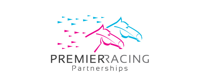
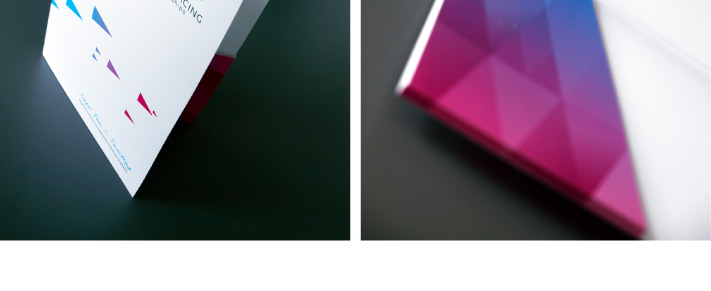
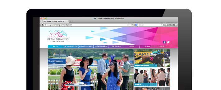
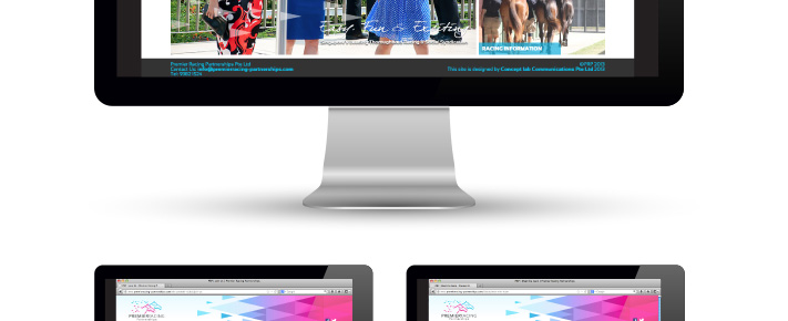
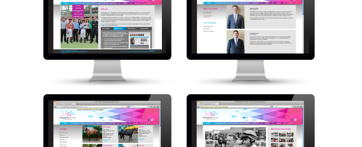
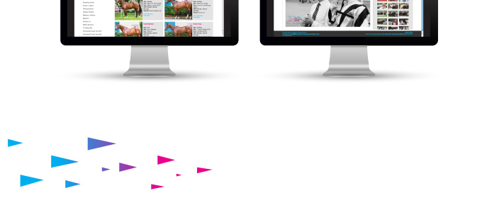
We created the PRP brand identity, stationery collateral as well as website design and programming, which included a Content Management System (CMS) for easy update of match results and events. The brand identity sports a clean rendition of two horses to represent partnership, with a set of forward-looking and dynamic triangles, which are expanded to brand elements throughout the collateral. The colours chosen are a bright pink and turquoise, to embody the easy, fun and exciting mood.
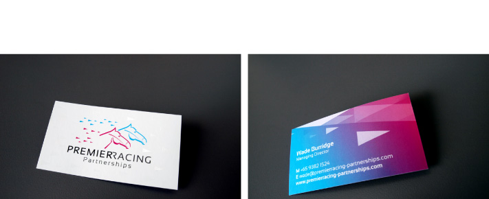
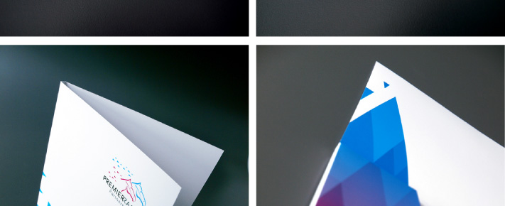
The contemporary brand identity created is then applied onto business cards, a corporate folder, and the web design. All in all, it was a cool branding project that the client and us enjoyed tremendously and took off very well.
The items presented here are testimonial of a job well done, and we wish PRP a great galloping start with what we have produced! Trot along with www.premierracing-partnerships.com for constant updates. |